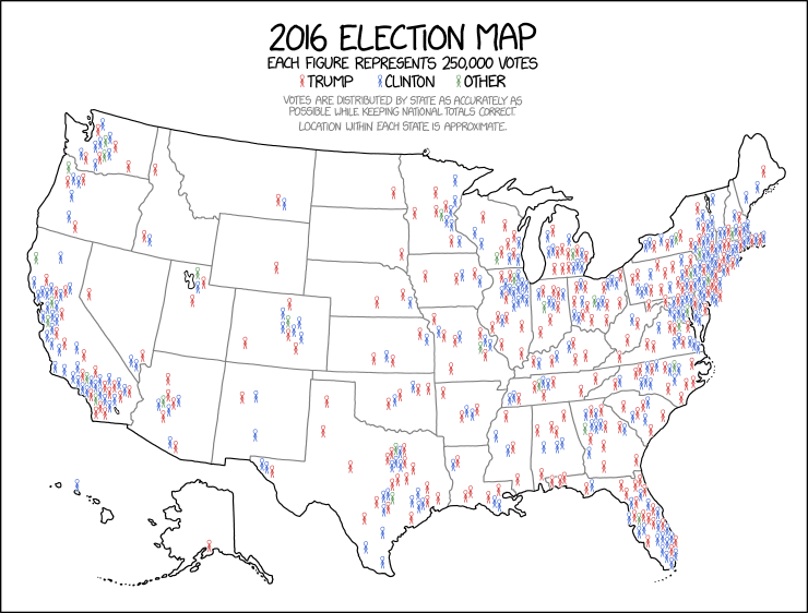

I like the idea of cartograms (distorted population maps), but I feel like in practice they often end up being the worst of both worlds—not great for showing geography OR counting people. And on top of that, they have all the problems of a chloro... chorophl... chloropet... map with areas colored in.